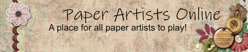

I've been working on a banner idea for us with the Birds of a Feather kit. I would appreciate any feedback (positive or negative).
Edited to remove because of TOU!
PAO Banner--Another Version page 2


Re: PAO Banner
I like the colors too, and the little bird! The charm is a great addition.
Re: PAO Banner
Here's another version with some more fall like colors. I tried the white on the frames but it looked really stark so I tried a burgundy/brown.
I put the first one on too, so you could compare side by side.
Thank you for your input!
Edited to remove because of TOU!
I put the first one on too, so you could compare side by side.
Thank you for your input!
Edited to remove because of TOU!
Re: PAO Banner--Please look at Version 2
This is beautiful! Both versions, actually. The only thing I would request would be that it be a bit shorter. I can shrink it in all directions so the scale is maintained, but for some users, that size might take up a substantial portion of their browser space. The current banner is 650x109 px. Wider than that is fine, but probably not much taller.
Also, Pam was gracious enough to do a smaller version (about half the width of the forum banner) that I could post to the homepage and the gallery. Not that this would be required, but it would be really nice looking if all three parts of the site could coordinate. I don't have the exact dimentions that she used for the smaller one, but it won't fit on the homepage is it's any wider than 610. The height looks to be about 150? I can't be certain. This is optional, of course, but I thought I'd still put it out there.
I'm trying to keep my eye out for banner submissions. If there's another submission and I missed it, please PM me!
Beautiful work!
Admin
_____________________________________
#1 in the order of the PAO
_____________________________________
#1 in the order of the PAO
Re: PAO Banner--Please look at Version 2
Here are 3 smaller versions. Stepping down by 25 pixels then 50, then 100
- Attachments
-
- Banner175x700.jpg (38.82 KiB) Viewed 576 times
-
- Banner150x600.jpg (33.53 KiB) Viewed 576 times
-
- Banner100x400.jpg (23.81 KiB) Viewed 575 times

Re: PAO Banner--Please look at Version 2
I just checked the sizes on them: The smaller version is 650 x 217 @ 300 dpi. The longer one is 650 x 109 @ 300 dpi. Did I further reduce it or not? I don't remember.
-
julierealtor
Re: PAO Banner--Please look at Version 2
Love these Rachelle...think I prefer the brown...or burgundy, it's softer
Re: PAO Banner--Please look at Version 2
It has been brought to my attention that using my banner for our forum may be a violation of CS TOU. I think we should find out before we post it. I would be happy to give them credit and/or ask their permission first. Any thoughts?
-
julierealtor
Re: PAO Banner--Please look at Version 2
I think if we give them credit we should be good...but probably better ask....

Re: PAO Banner--Please look at Version 2
For what it's worth, I like the burgundy version but not the dark beads over by the 'create' charm. I like the lighter pink things on the first version as they don't seem to distract as much from the charm.
It's a lovely design but I wonder also about using something so obviously CS.
It's a lovely design but I wonder also about using something so obviously CS.
-
LadyJaine
Re: PAO Banner--Please look at Version 2
I also am not so much a CS kind of scrapper at the moment. I started working on a banner, but the TOU for the kit I wanted to use specifically preclude web design.mpizzazz wrote:For what it's worth, I like the burgundy version but not the dark beads over by the 'create' charm. I like the lighter pink things on the first version as they don't seem to distract as much from the charm.
It's a lovely design but I wonder also about using something so obviously CS.